
Design Tips From our Fernside Court Project
06/07 DESIGN TIPS
A few of our favorite takeaways from our latest project!
With every project comes new lessons learned…
& after 6 months of working on our Fernside Court Contemporary Project, we are excited to share a few of our favorite takeaways & design tips from the process of bringing this home to life!

No. 1: Focus on creating a cohesive feeling in an open-concept space
We love the challenge of designing open-concept spaces, and doing it well is all about making sure that all of the finishes and pieces work together and not against each other.
Each element introduces something new to the space, from the paint colors to the textile patterns, and it can be tricky to find the right balance.
Here are a few examples of how we achieved a calming look in this project:
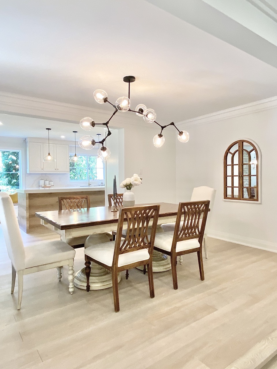
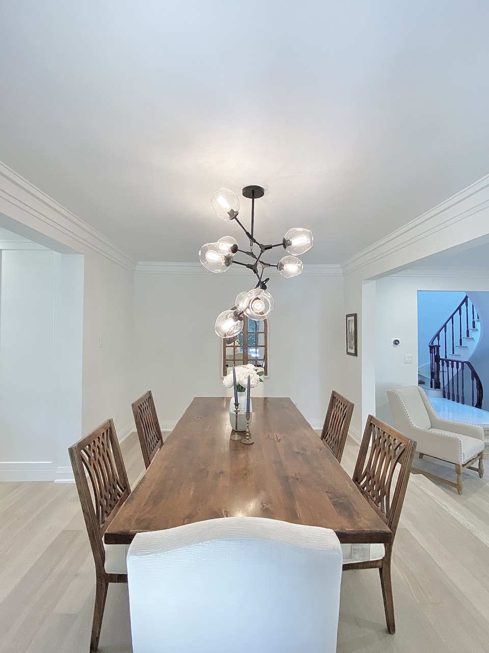
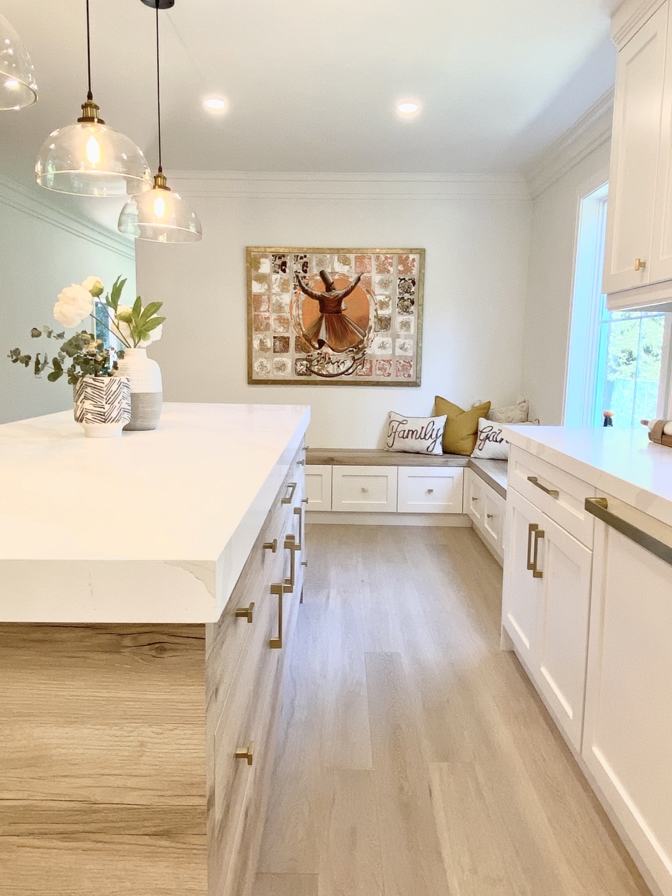
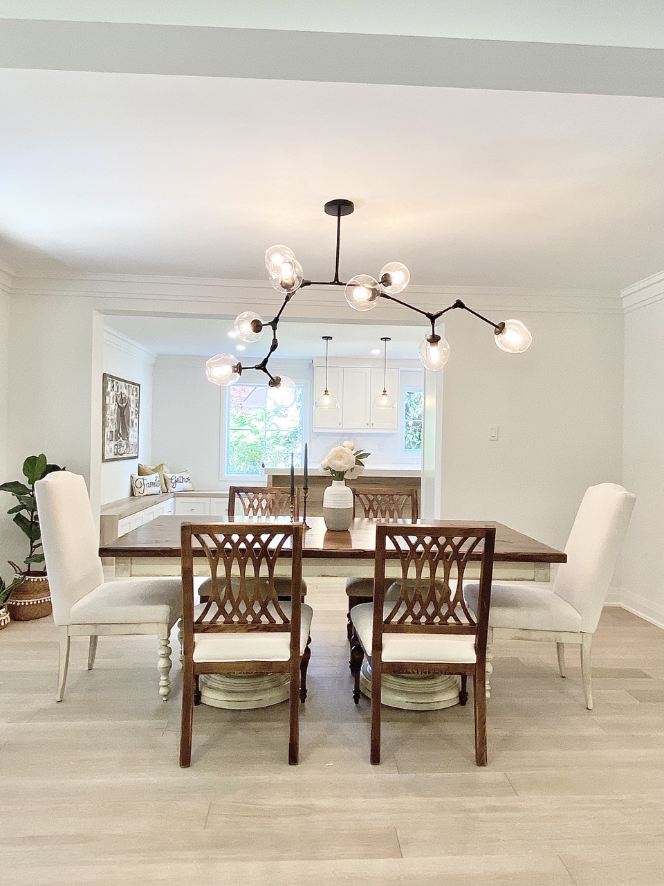
In the Dining & Kitchen Space, we wanted to have a lot of seating and it was important to make sure each chair was different enough that it looked intentional but similar enough to flow together.
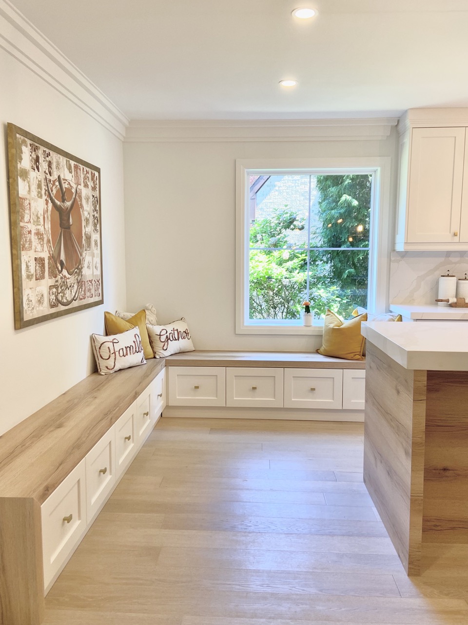
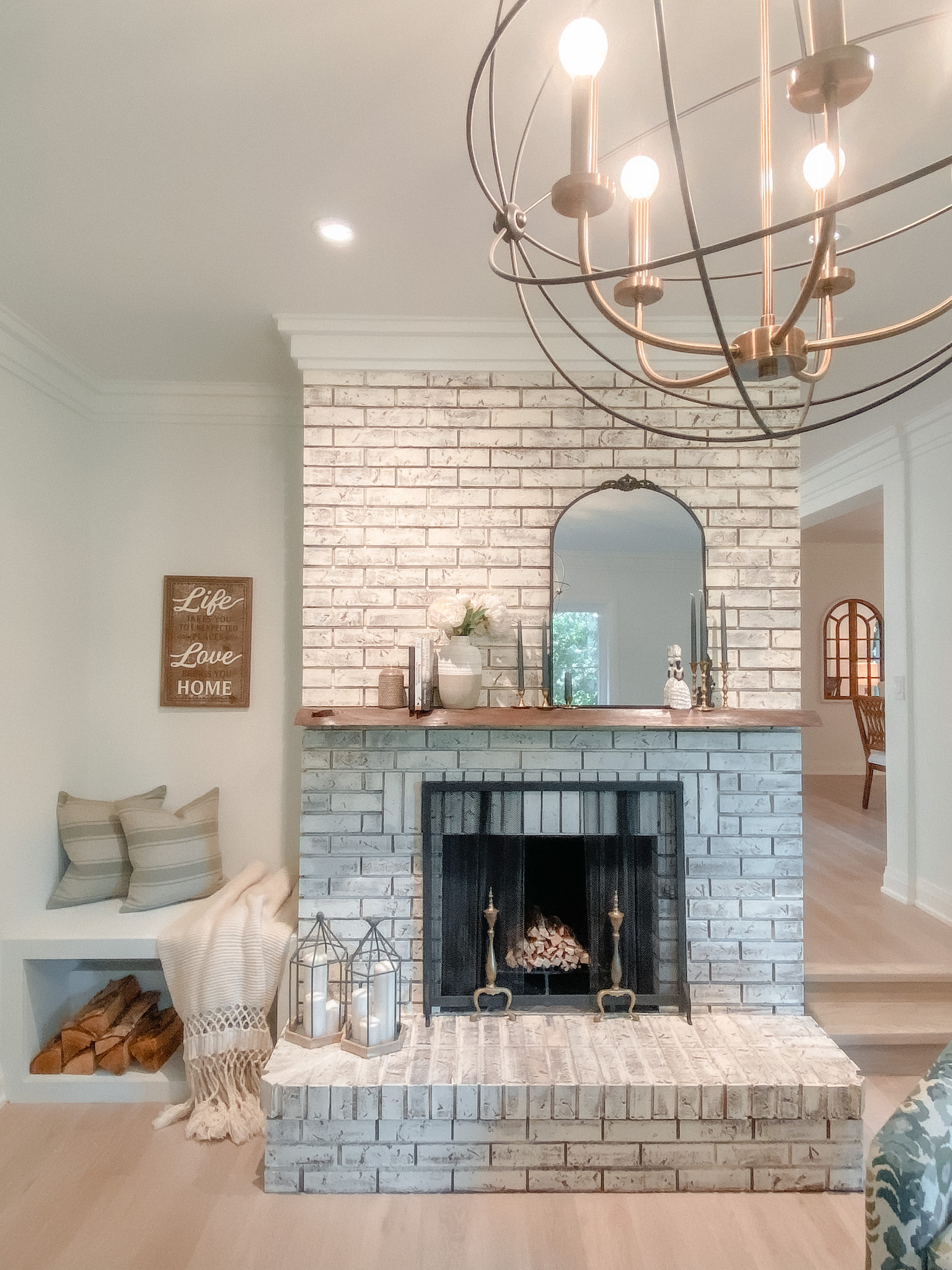
There was an old style fire place brick wall which was faced the kithcen. We closed the wall with drywall in order to expand the benches. They are an amazing spot can be used for seating on friends gatherings and also could be a cozy breakfast area.
For the bench top design, we use the same wood material as island wood to blend it with tother parts oof the kitchen.
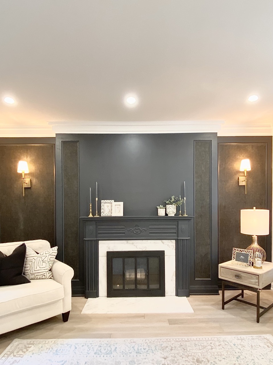
One of the simplest ways to create a cohesive look in an open-concept space is by working with a minimal color palette. When we started working on this project, one of our client’s first requests was that we use muted tones, which allowed us to layer in a lot of textural elements to bring in dimension.
To bring some colour to the muted tone, we did some carpentry on the the wall around the fireplace and use the mix of dark paint and wall paper to make it as a focal point of the living room.
No. 2: Think out of the box with styling
There is not always a clear solution when it comes to styling, but that’s where the fun comes in! In this project, we got to play around with a few of our favorite tricks for merging form and function. Here are a few you can apply in your own space:
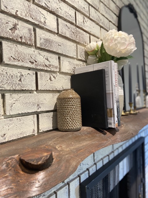
Do not overdo with styling. Use decent amount of accessories on your Manter. The Mantel is picked from Lumber Section of HomeDepot.
Mixi-matching of different sizes of ceramic vases always work really well with books.
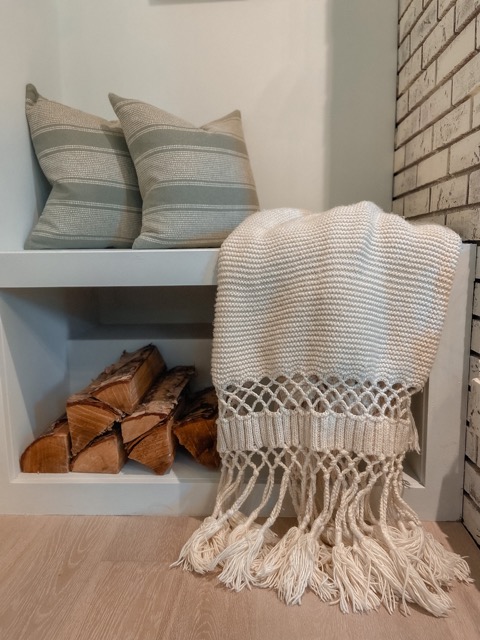
Throw pillows and blankets would bring a playful look to your design. Piling up some natural wood beside the fireplace creates a warmer hygge look. The throw blanket is from our best seller blanket collection Hyggeh hand-knitted-blanket
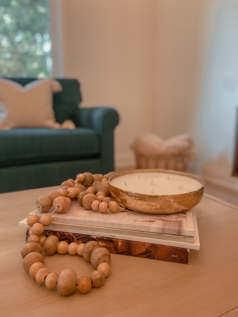
A simple way of designing coffee table. Piling up a couple of books can work as a great riser in styling.You can put any accessories you like on top of them to bring more luxury vibe. The Candle is from Homesence
No. 3: The smallest details can make the biggest difference
When working with a minimal color and material palette, paying attention to the little details makes all the difference. Here are a few ways we elevated the spaces in this home:
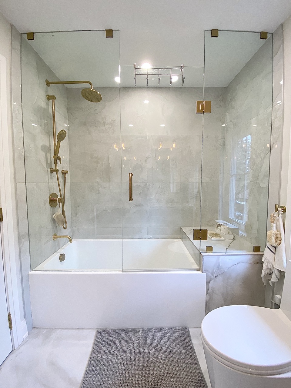
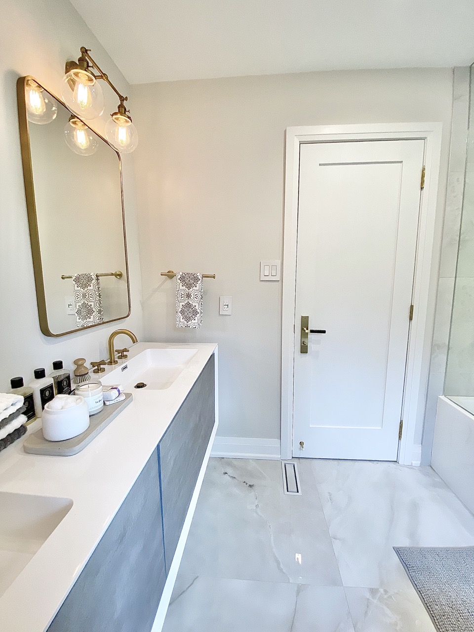
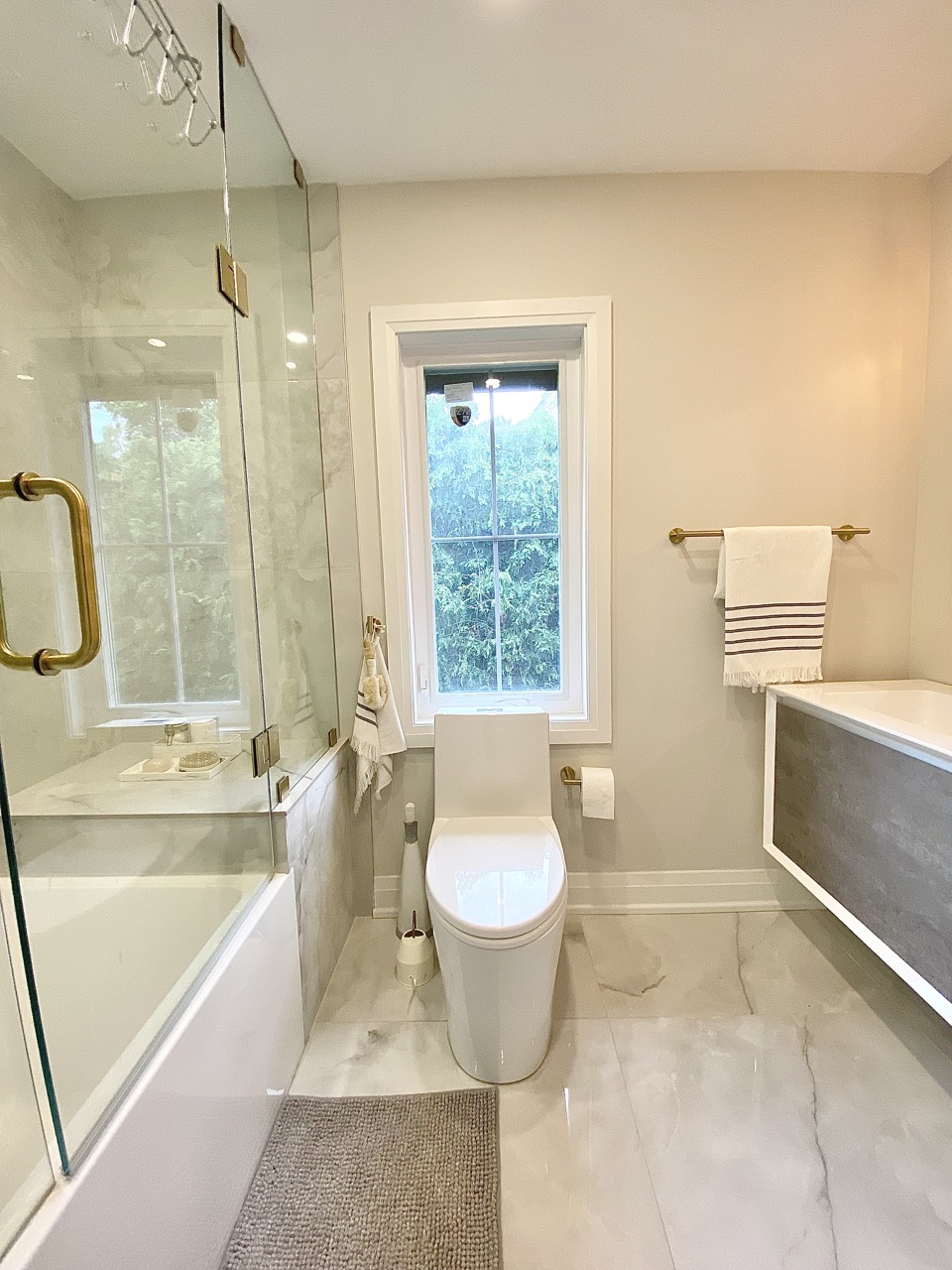
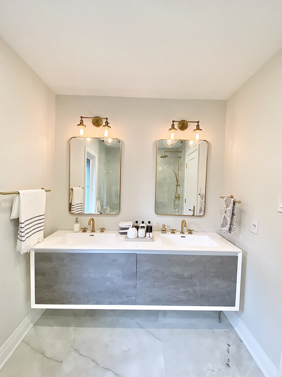
In the Master bathroom we ended up using light grey color, We matches different tones of grey in our renivation. From the vanity cabinet in darker tone going to the floor and bathtub walls in a lighter ceramic tone. The rug and even the towels have a grey tone to make a harmony with the whole design. Even the walls we avoided ultra white and we used OC-27 Benjamin Moore. The brushed brass gold faucets would be an amazing combination with light colors. All the shower accessories and faucets are from our favourite luxury brand Robinet. The Light bulbs are from Hyggeh lighting collection.